5.5.2 BP/RP flux excess
Author(s): Carme Jordi, Claus Fabricius
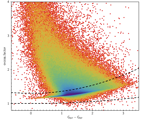
To a first approximation we expect the sum of and fluxes to exceed the flux by only a small factor (due to the shapes of the passbands, see Figure 5.9) with a small dependence on colour.
The and fluxes, and , are calculated as the sum of the flux in a window of arcsec. Since the data processing for Gaia DR2 does not include deblending treatment, and can suffer contamination by nearby sources. Instead, the flux is derived from LSF or PSF fitting to a narrow image and the contamination issue is not significant. Any error in the background estimate also affects the and fluxes more than the flux. Therefore, if accurate colour information is required, the consistency of the three fluxes should be checked.
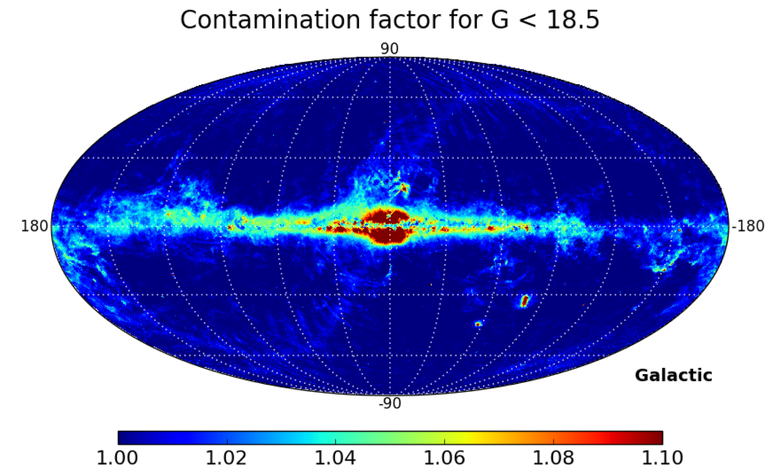
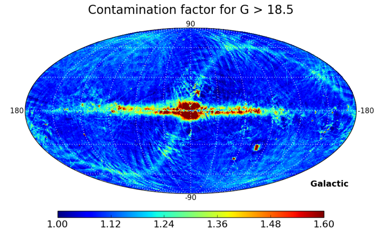
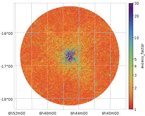
Figure 5.26 shows the median simple flux ratio in galactic coordinates for the sources brighter and fainter than . This ratio is called phot_bp_rp_excess_factor. One can appreciate that the faint sources have flux ratios larger than the bright set. One can also notice that the excess factor is larger in the ecliptic plane area indicating an under-subtraction of the sky background.
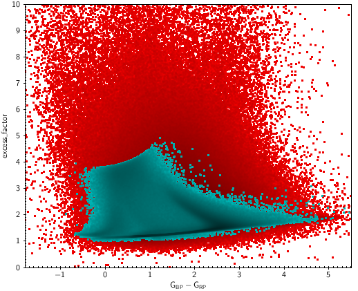
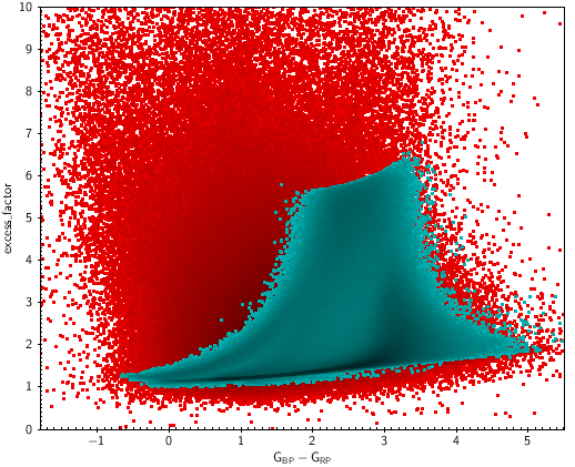
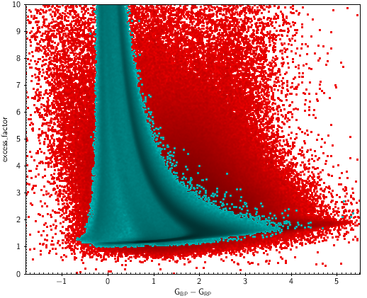
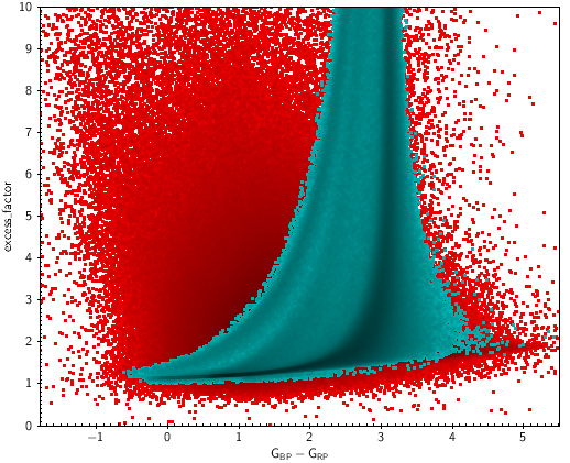
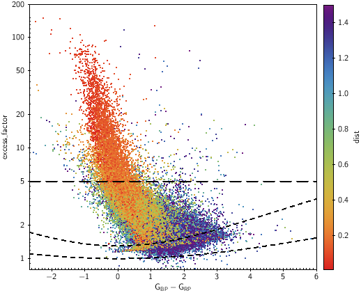
Figures 5.27 to 5.32 show the flux ratio (I+I)/I for several sets of sources: at high galactic latitudes, nearby sources, at the Galactic centre, of a globular cluster, in the sky area of LMC and quasars. The nearby sources, the QSOs and the sources at high latitudes are mainly affected by issues in the background subtraction. Sources in crowded areas like the Galactic centre, LMC area or globular clusters are mainly affected by contamination due to nearby sources.
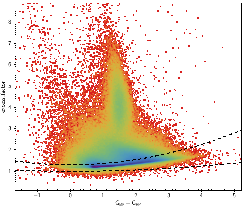
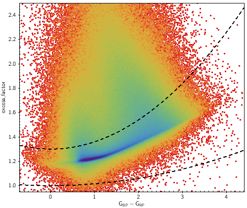
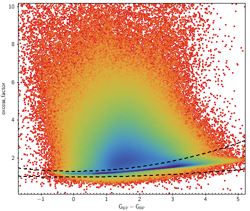
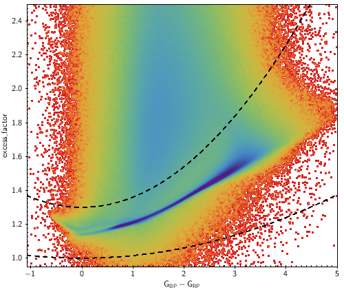
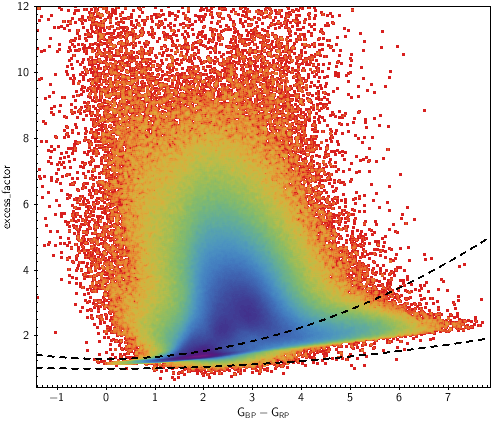
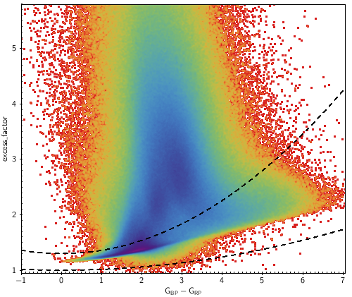
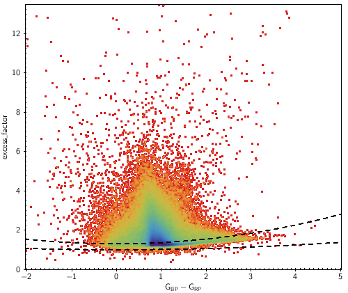
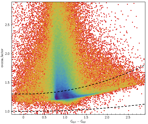

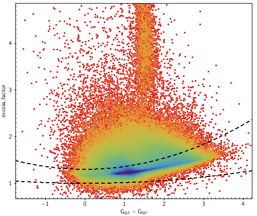
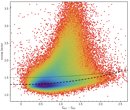
Figure 5.33 shows the case of sources close to a very bright star. The example shows the case of Sirius, but the same effect happens around any other bright star. There is a strong dependence of the excess factor with the distance to a bright star. The closer and fainter the source, the bluer it becomes deviating its position in the colour magnitude diagram.
Figures 5.34 shows how well-behaved sources are shifted in the excess factor vs colour diagram when a contamination is added. The purpose of this simple simulation is to illustrate that (a) the colour does not change much when the contaminant source and the contaminated source have the same colour, (b) the red sources become bluer when the contaminant source is of blue colour, and (c) the other way around, the blue sources become redder when the contaminant source is of red colour.